Datagrok UI
This article describes the routines for building a user interface in Datagrok. See JS API class reference for details.
The UI library provides primitives (buttons, dialogs, accordions, popups, etc), as well as input controls, spreadsheets, and viewers such as scatterplots. See UI class reference for details.
Live examples
The following code examples are available from the code editor within Datagrok. See API Examples
Design toolkit
Figma Datagrok UIKit available on Figma Community
Table of contents
Layouts
Elements
Components
Layouts
Starting point
To start building a layout you need either a View (in most cases) or a Dialog. Every View or Dialog is a panel container.
let v = grok.shell.newView('Demo View');
v.append(ui.h1('Hello World'));
let d = ui.dialog('Demo Dialog');
d.add(ui.h1('Hello World'));
d.show();
Containers
This is a simple container. It can contain any elements, such as inputs, images, text, etc. It doesn't have own height. The container height depends on its children.
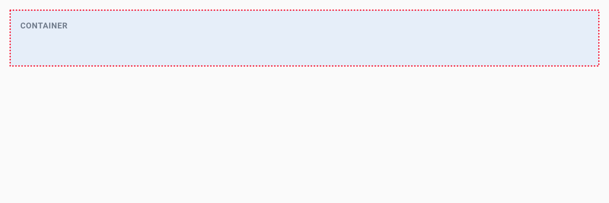
ui.div([ui.h1('Header'), ui.p('Paragraph text'), 'just text', DG.Viewer.scatterPlot(grok.data.demo.demog())])
If you place a container within a box container , it will inherit the box size and show scroll bars automatically.
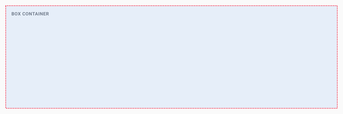
Boxes
This is a fixed-size container. It doesn't depend on children element sizes, but shrinks them to certain size.
let d = ui.div();
for (let i = 0; i < 100; i++)
    d.append(ui.p('More Text'));
var box = ui.box(d);
$(box).css('border', 'solid');
ui.div([ui.h1('Header'), box])
Panels
The panel is a simple container similar to Containers. It takes the full available width, and its height depends on its children. Also, panels have 10px paddings for all sides.
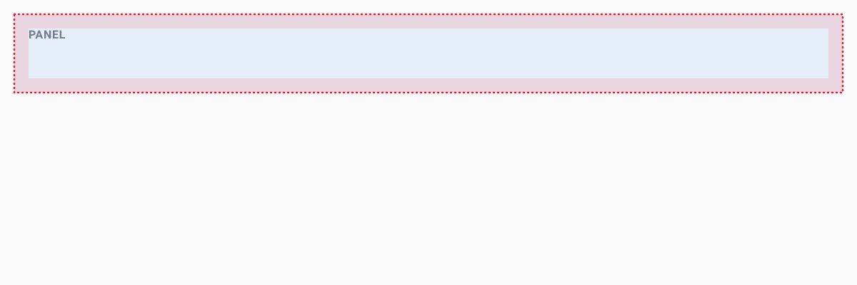
ui.panel([ui.h1('Header'), ui.p('Paragraph text'), 'just text', DG.Viewer.scatterPlot(grok.data.demo.demog())])
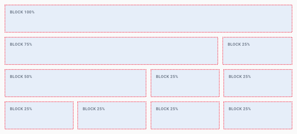
Blocks
The block layout is divided into horizontal sections, which take on the full width of the available screen. Their screen height is determined by their inner content. The width of sections can also be set to the following predefined ratios:
- 1 block: 100%
- 2 blocks:
- 50% and 50%
- 75% and 25%
- 25% and 75%
- 3 blocks:
- 2 x 25% and 50%
- 50% and 2 x 25%
- 4 blocks: 4 x 25%
Use the block layout if you want to display section-based content by placing elements next to each other.
ui.block([ui.h1('Block 100%')]);

// 2 blocks next to each other
ui.block75([ui.h1('Block 75%')]);
ui.block25([ui.h1('Block 25%')]);

// 3 blocks next ot each other
ui.block50([ui.h1('Block 50%')]);
ui.block25([ui.h1('Block 25%')]);
ui.block25([ui.h1('Block 25%')]);

// 4 blocks next ot each other
ui.block25([ui.h1('Block 25%')]);
ui.block25([ui.h1('Block 25%')]);
ui.block25([ui.h1('Block 25%')]);
ui.block25([ui.h1('Block 25%')]);
Flexbox grid
Flexbox grid lets you divide a layout into multiple columns and rows. The Flexbox container takes the full available width, and its height is determined by the inner content. A Flexbox layout has a direction in which child elements are laid out. The main axis is defined by rows or columns.
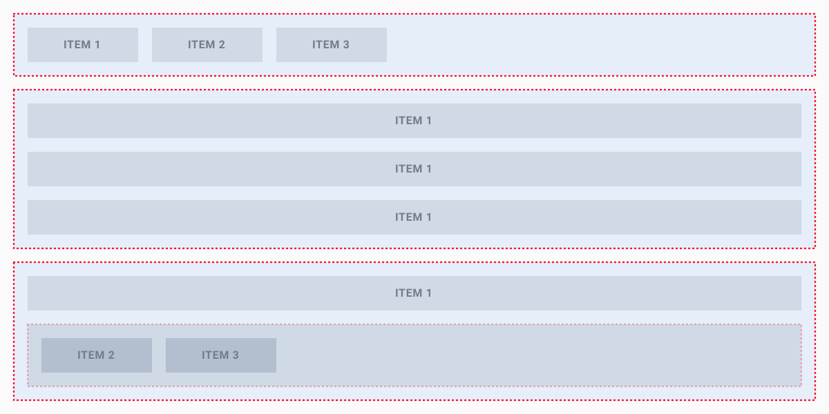
ui.divH([ui.span('Item 1'), ui.span('Item 2'), ui.span('Item 3')]); // One row
ui.divV([ui.span('Item 1'), ui.span('Item 2'), ui.span('Item 3')]); // One column
ui.divV([ui.span('Item'), ui.divH([ui.span('Item 2'), ui.span('Item 3')])]); // Combined row and column
Splitters
Splitters - help to build the layout that contains several content areas. Each splitter contains the box container which shrinks the content to a certain size.
You can specify splitters with horizontal or vertical orientation. To split vertically and horizontally at the same time, nest the splitters.
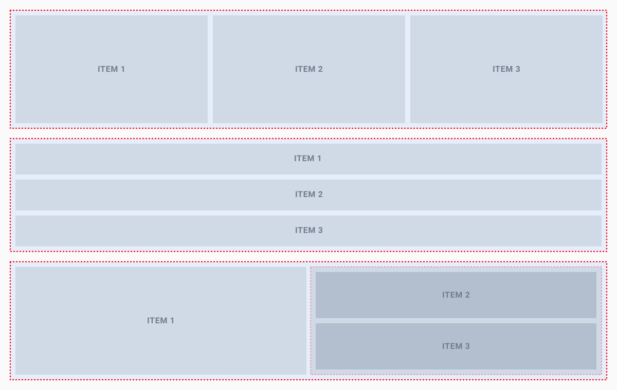
ui.splitH([ui.h1('Left'), ui.h1('Center'),  ui.h1('Right')])
ui.splitV([ui.h1('Top'), ui.h1('Middle'), ui.h1('Bottom')])
ui.splitH([ui.h1('Left'), ui.splitV([
  ui.h1('Right top'),
  ui.h1('Right bottom')
  ])
])
Views
Table view
Table view - a view container with a grid table that contains a set of data that is structured in rows and columns. It allows the user to scroll in both directions and can contain large numbers of items and columns.
let table = grok.data.demo.demog();
let view = grok.shell.addTableView(table);
Simple view
Simple view is an empty view container that can contain any kind of elements.
let view = grok.shell.newView('Simple View');
Viewers
A viewer is a visual component associated with a table. Viewers belonging to the same view all share the same row selection and filter. Viewers are saved as part of the project. You can also save viewers and views individually and reuse them.
Bar chart
A bar chart presents grouped data as rectangular bars with lengths proportional to the values that they represent. Unlike histograms which you can apply to display the distribution of numerical data, bar charts are primarily designed for categorical values.
let view = grok.shell.addTableView(grok.data.demo.demog());
view.barChart({
split: 'race',
value: 'age',
valueAggrType: 'avg'
});
Box plot
The box plot (a.k.a. box and whisker diagram) is a standardized way of displaying the distribution of data based on the five number summary: minimum, first quartile, median, third quartile, and maximum.
let view = grok.shell.addTableView(grok.data.demo.demog());
view.boxPlot();
Calendar
Calendar lets you analyze longitudinal data. It needs at least one column of type DateTime.
let view = grok.shell.addTableView(grok.data.demo.demog());
view.calendar();
Correlation plot
A quick way to assess correlations between all columns at once. Cells are color-coded by the Pearson correlation coefficient. Histograms along the diagonal show the corresponding distribution. Hover over the cell to see the corresponding scatter plot. The grid is sortable. Select columns in the view by selecting corresponding rows.
let view = grok.shell.addTableView(grok.data.demo.demog());
view.corrPlot({
  xs: ['age', 'weight', 'height'],
  ys: ['age', 'weight', 'height'],
});
Density plot
Unlike Scatter plot that visualizes each individual data point, density plot splits 2D area by bins, and color-codes it depending on the number of points that fall within this bin. The darker the color, the more points it contains.
let view = grok.shell.addTableView(grok.data.demo.demog());
view.densityPlot();
Filters
A set of controls for quick filtering, selection, and visual assessment of column values.
let view = grok.shell.addTableView(grok.data.demo.demog());
view.filters();
Form
Form allows you to customize the appearance of the row by manually positioning the fields, and adding other visual elements, such as pictures or panels. A form can be used either as a stand-alone viewer, or as a row template of the Tile viewer.
let view = grok.shell.addTableView(grok.data.demo.demog());
view.form();
Globe
Visualizes magnitude and color for data on a 3D globe using latitude and longitude.
grok.data.getDemoTable('geo/world_pop_1990.csv').then((t) => {
  grok.shell.addTableView(t).addViewer('Globe');
});
Google map viewer
Google Map Viewer overlays latitude/longitude data from the corresponding table on top of the Google Map.
let view = grok.shell.addTableView(grok.data.demo.geo());
view.googleMap();
Grid
A grid table contains a set of data that is structured in rows and columns. It allows the user to scroll in both directions and can handle large numbers of items and columns.
let view = grok.shell.addTableView(grok.data.demo.demog());
view.grid.setOptions({
    colHeaderHeight: 80,
});
Heat map
A Heat Map is a graphical representation of table where each cell value is represented as color. It is based on grid, so all of the grid's features are applicable to the heat map as well.
let view = grok.shell.addTableView(grok.data.demo.demog());
view.heatMap();
});
Histogram
A histogram is a graphical representation of the distribution of numerical data.
let view = grok.shell.addTableView(grok.data.demo.demog());
view.histogram({
    value: 'age'
});
Line chart
Line chart displays information as a series of data points connected by a line.
let view = grok.shell.addTableView(grok.data.demo.demog());
view.lineChart();
Markup viewer
Use this viewer to host any text, arbitrary HTML content, or markdown-formatted text. In most cases, the viewer will auto-detect content type. Use the "mode" property to explicitly specify it.
let table = grok.data.testData('demog', 10000);
let view = grok.shell.addTableView(table);

let markup = `<div style="padding:0px 20px">
<h2>HTML Markup</h2>
Markup Viewer lets you combine HTML markup with the properties that are dynamically evaluated against
the current dataset. This is useful for creating custom dashboards, or telling stories with data. Here are some
examples that illustrate most important concepts:
`;

view.markup({content: markup});
Matrix plot
Use Matrix Plot to assess the relationship among many pairs of columns at the same time.
let view = grok.shell.addTableView(grok.data.demo.demog());
view.matrixPlot();
Network diagram
Network diagram is used to visualize graphs, where values of the specified two columns become nodes, and rows become edges. It is possible to color-code and size-code nodes and columns by choosing the aggregate function that would apply to the values that represent an edge or a Node.js.
let view = grok.shell.addTableView(grok.data.demo.demog());
view.networkDiagram();
Parallel coordinates plot
Parallel coordinates is a common way of visualizing high-dimensional geometry and analyzing multivariate data.
To show a set of points in an n-dimensional space, a backdrop is drawn consisting of n parallel lines, typically vertical and equally spaced. A point in n-dimensional space is represented as a polyline with vertices on the parallel axes; the position of the vertex on the i-th axis corresponds to the i-th coordinate of the point.
This visualization is closely related to time series visualization, except that it is applied to data where the axes do not correspond to points in time, and therefore do not have a natural order. Therefore, different axis arrangements may be of interest.
let view = grok.shell.addTableView(grok.data.demo.demog());
view.pcPlot();
Scatter plot 3D
Use 3D scatter plot to plot data points on three axes to show the relationship between three variables. Each row in the data table is represented by a marker whose position depends on its values in the columns set on the X, Y, and Z axes. Additionally, you can color-code and size-code points, as well as display labels next to markers.
let view = grok.shell.addTableView(grok.data.demo.demog());
view.scatterPlot3d();
Scatter plot
A scatter plot (also called a scatter graph, scatter chart, scattergram, or scatter diagram) is a type of plot or mathematical diagram using Cartesian coordinates to display values for typically two variables for a set of data. If the points are color-coded you can increase the number of displayed variables to three. The data is displayed as a collection of points, each having the value of one variable determining the position on the horizontal axis and the value of the other variable determining the position on the vertical axis.
let view = grok.shell.addTableView(grok.data.demo.demog());
let plot = view.scatterPlot({
    x: 'height',
    y: 'weight',
    size: 'age',
    color: 'race',
});

plot.setOptions({
    showRegressionLine: true,
    markerType: 'square'
});
Shape map
Shows a map that is applicable for the specified dataset. Typically, it would represent a geographical area (countries, states, counties, etc), but it also supports arbitrary shapes (such as a store floor plan, brain regions, or EEG electrodes).
When opened, a viewer automatically determines the best map that is applicable to the current dataset.
grok.data.loadTable('https://public.datagrok.ai/demo//earnings-by-state.csv').then((t) => {
  let view = grok.shell.addTableView(t);
  view.shapeMap();
});
Statistics
Provides specified descriptive statistics for the chosen columns.
let view = grok.shell.addTableView(grok.data.demo.demog());
view.statistics();
Tile viewer
Visualizes rows as a collection of forms that are positioned as tiles.
let view = grok.shell.addTableView(grok.data.demo.demog());
view.tileViewer();
Tree map
Tree maps display hierarchical (tree-structured) data as a set of nested rectangles. Each branch of the tree is given a rectangle, which is then tiled with smaller rectangles representing sub- branches. A leaf node's rectangle has an area proportional to a specified dimension of the data.
let view = grok.shell.addTableView(grok.data.demo.demog());
view.treeMap();
Ribbon
Ribbon is a layout container that appears in the header of the view.
The ribbon panel can include text links and buttons, icons, dropdown menus, and Combobox, or any combination of those elements. Each collection with elements will be divided by a separator and evenly distributed in the container.
// Ribbon panel
let view = DG.View.create();
view.setRibbonPanels([
 [
 ui.divText('Custom panel')
 ],
 [
   ui.iconFA('search', () => grok.shell.info("clicked")),
   ui.iconFA('plus', () => grok.shell.info("plus"))
 ]
]);

// Ribbon dropdown menu
view.ribbonMenu = DG.Menu.create()
 .group('Menu')
 .item('element 1');
Toolbox
The toolbox is a container that appears on the left side of the view. It is mostly used for placing UI controls and can contain any kind of elements such as buttons, fields, icons, links, dropdown menus, accordions, etc.
let view = grok.shell.newView('toolbox demo');
let acc = ui.accordion();
acc.addPane('header 1', () => ui.divText('Dynamic content'));
view.toolbox = acc.root;
Dialogs
A dialog is a control that informs the user about a task or displays necessary information and requires a decision. The dialog contains the following sections and options:
- Title: Title text appears in the dialog header.
- Content: This area contains the actual content of the dialog.
- Footer with actions: The footer can contain optional buttons and a context menu. If no buttons are defined, the default Close button is shown.
There are three types of dialogs:
- standard dialog
- modal dialog
- fullscreen modal dialog
For each dialog, you can set the position by viewport by the X and Y axes.
Standard dialog
// Standard dialog
ui.dialog('Standard dialog')
  .add(ui.span(['Some content...']))
  .onOK(() => {})
  .addContextAction('My Action', () => {})
  .addButton('Optional button')
  .show({x: 300, y: 300});
Modal dialog
// Modal dialog
ui.dialog('Modal dialog')
  .add(ui.span(['Some content...']))
  .onOK(() => {})
  .showModal();
Fullscreen modal dialog
// Fullscreen modal dialog
ui.dialog('Modal dialog')
  .add(ui.span(['Some content...']))
  .onOK(() => {})
  .showModal(true);
Elements
Colors
Color palette is a predefined set of colors. The colors are fixed and do not change.
let v = grok.shell.newView('palettes');

function getBlock(c) {
  let block = ui.divText(DG.Color.toRgb(c));
  block.style.backgroundColor = DG.Color.toRgb(c);
  block.style.color = DG.Color.toRgb(DG.Color.getContrastColor(c));
  return block;
}

v.appendAll([
  ui.h1('Categorical palette with contrast text color'),
  ui.div(DG.Color.categoricalPalette.map(getBlock)),
  ui.h1('Category colors (looping over the palette)'),
  ui.div(DG.utils.identity(30).map(DG.Color.getCategoricalColor).map(getBlock))
]);
Typography
Typography sets default styles for headings, paragraphs, spans, and divs elements.
Headers
ui.h1('Header 1');
ui.h2('Header 2');
ui.h3('Header 3');
Paragraphs
ui.p('Lorem Ipsum is simply dummy text of the printing and typesetting industry. Lorem Ipsum has been the industrys standard dummy text ever since the 1500s, when an unknown printer took a galley of type and scrambled it to make a type specimen book.');
Spans
ui.span(['span element']);
Label
A label is the name or title of a control or group of related controls.
ui.label('label text');
Link
Link is a clickable text element than can be used for navigation or to trigger an event.
ui.link('datagrok','https://datagrok.ai','tooltip message'),
ui.link('Hello',()=>{grok.shell.info('hello')},'tooltip message')
Inline text
ui.inlineText(['Inline ',ui.link('text',()=>{grok.shell.info('')},'click me','')])
Text blocks
ui.divText('Lorem Ipsum is simply dummy text of the printing and typesetting industry. Lorem Ipsum has been the industrys standard dummy text ever since the 1500s, when an unknown printer took a galley of type and scrambled it to make a type specimen book.');
Tables
Table - display information in a grid-like format of rows and columns. Table can contain interactive components such as buttons.
// Creates a visual table based on [items] and [renderer]
var myList = [
{key: 'first object', value: ui.button('button')},
{key: 'second object', value: false},
];
let table = DG.HtmlTable.create(myList, (item, idx) => [item.key, item.value]);

// Creates a visual table based on [map]
ui.tableFromMap({
  project: grok.shell.project.toMarkup(),
  time: new Date(),
})
Lists
ui.list([
        'element 1',
        grok.shell.user,
        'element 3',
      ])
Buttons
Buttons allow users to trigger an action. There are 2 button types:
- Regular button
- Icon button
- Big button (Use big button for make focus on main or single action)
ui.button('Regular button');
ui.button(ui.iconFA('info'));
ui.bigButton('Big button');
Forms
A form presents UI controls and lets users enter data in a structured way.
ui.inputs([
  ui.input.string('Name'),
  ui.input.int('Age'),
  ui.buttonsInput([
    ui.bigButton('Apply'),
    ui.button('Cancel')
  ])
]);
Inputs
Input field allows users to enter and edit text or numeric values in one line. There are two types of input fields:
- Int input allows to enter or edit numeric value.
- String input allows to enter or edit text value.
- Search input is a string input with predefined parameters. It has the text "Search" as a placeholder, search-icon to the left side and hover-clear-icon to the right side of the input field. Also pressing Esc or the clear-icon clears the input.
ui.input.int('Age', {value: 30});
ui.input.string('Name', {value: 'Arthur Dent'});
ui.input.search('');
You can also customize string input like this. Parameters in curly braces are optional.
// You can just set the string name for the icon:
ui.input.string('', {icon: 'filter', clearIcon: true, escClears: true, placeholder: 'Filter models'});

// Or you can set icon with the ui-element:
let myIcon = ui.iconFA('');
ui.input.string('', {icon: myIcon, clearIcon: true});
Text area
The text area is an input control that allows the user to enter several lines of text.
ui.input.textArea('Label', {value: 'Text area text data'});
Dropdown selection
The select control is used to select an item from a predefined list.
ui.input.choice('Label', {value: 'Value 1', items: ['Value 1', 'Value 2']});
Selection
The selection control lets you set a binary value (true/false). When the user clicks the selection control, it toggles between checked and unchecked.
ui.input.bool('Name', {value: false});
Group selection
Group selection is commonly used to select one or more option from the predefined list.
ui.input.multiChoice('Group label', {value: ['Value 1', 'Value 2'], items: ['Value 3', 'Value 4']});
Switch
The toggle switch allows users to set individual features to either active or inactive.
ui.input.toggle('Active', {value: true});
Range slider
Range slider is a UI control that enables to select a value range within a predefined interval.
ui.rangeSlider(0, 10, 2, 5);
Color picker
UI element that lets a user specify a color, either by using a visual color picker interface or by entering the color into a text field in hexadecimal format.
ui.input.color('Hair color', {value: '#ff0000'});
Icons
The icon control displays the icon from the FontAwesome library. Icon can used as a button control. Use FontAwesome without 'fa' prefix.
ui.iconFA('question',()=>{})
Image
Image control is a visual component that integrates images into your app. It could have an external link and a specific size.
ui.image('https://datagrok.ai/help/visualize/viewers-interaction-main.gif',400,200,{target:'https://datagrok.ai/help/visualize/viewers'});
Components
Accordions
The accordion control is a container for grouping elements into panes. Each pane can collapse or expand and can contain any UI elements.
let acc = ui.accordion();
acc.addPane('Pane label', () => ui.div([
  ui.h1('Header 1'),
  ui.button(' Button'),
  ui.input.textArea('label', {value: 'multi\nline\ntext'})])
);
Await (loading indicator)
Await informs the user about an ongoing operation.
ui.wait(async () => {
  let root = ui.div();
  return root;
})
Drag and drop
Drag and drop is an option for elements in which the user selects the element by "grabbing" it and dragging it to a droppable place.
let dropElement = ui.input.string('Drop here...', {value: ''});
let dragElement = ui.div('Drag it');
ui.makeDroppable(dropElement.input, {
    acceptDrop: (o) => true,
    doDrop: (o, _) => {
        dropElement.value = o.innerText;
    }
});
ui.makeDraggable(dragElement, {
    getDragObject: () => dragElement,
    getDragCaption: () => 'Caption when dragging'
});
Cards
A card is used to display content composed of different elements whose size or supported actions can vary.
ui.card(
  ui.div([
    ui.h1('header'),
    ui.divText('Some text'),
    ui.button('Regular')
  ]))
Combo popup
The combo box control allows users to select an item from a predefined list.
ui.div([ui.comboPopupItems('Combo popup label', {
      'Item 1': () => {},
      'Item 2': () => {},
  })]);
Markdown
Markdown is a control that renders Markdown documents into your app.
let document = `## Intro
Datagrok unlocks the value of the complex data by empowering non-technical users to: \n
  * [Discover](/help/discover/fair).
  * [Cleanse](/help/transform/data-wrangling).
  * [Visualize](/help/visualize/viewers).
  * [Explore data](/help/#explore).
  * [Build and deploy predictive models](/help/learn/predictive-modeling).
  * [Collaborate with others](/help/collaborate/sharing).
`;

grok.shell.newView('Markdown example',[
  ui.markdown(document)
]);
Popup menu (context menu)
Menus appear upon interaction with a button, action, or other control. They display a list of choices, with one choice per line. Menus can also have a multilevel list of choices.
let showMenu = () => {
  let showBalloon = (item) => grok.shell.info(item);
  DG.Menu.popup()
      .item("Show info", () => {})
      .separator()
      .items(["First", "Second"], showBalloon)
      .show();
};
let text = ui.divText("Clickable element");
text.addEventListener("click", showMenu);
Context panel
The context panel is the right sidebar panel used for showing the active item's properties.
grok.shell.o = ui.h1('Context panel');
Sidebar
Sidebar control is a left side container that can contain items with toolbox pane.
grok.shell.sidebar.addPane('FIRST', () => ui.divText('A panel'), ui.iconFA('smile'));
Tabs
Tab controls organize and allow navigation between different content areas or views.
ui.tabControl({
      'First Tab': ui.panel('First panel'),
      'Second Tab': () => ui.panel('Second panel')
  })
Tag editor
Tag editor is a control that displays small tag items, mainly to visualize selected items. You can add and remove tags.
let editor = DG.TagEditor.create();
editor.addTag('demo');
editor.addTag('test');
editor.addTag(1234);
Taskbar progress
Taskbar informs the user about loading progress at the bottom bar.
let pi = DG.TaskBarProgressIndicator.create('Progress...');
setTimeout(() => {
  pi.close();
}, 3000);
Toasts
A message toast is a small popup for success or error messages that disappears automatically after a few seconds. There are two types of message toast:
- Success message
- Error message
grok.shell.info('Success message');
grok.shell.warning('Warning message');
grok.shell.error('Error message');
Top menu (ribbon menu)
let view = grok.shell.newView('Demo View');
view.ribbonMenu = DG.Menu.create()
  .group('Menu label')
  .item('Item label', () => {});
Tooltips
Tooltip controls display informative text when the user hovers over an element.
ui.tooltip.bind(ui.label('Label'), 'Tooltip message');
Tree view
A tree view control presents a hierarchical view of information. Each item can have a number of subitems. One of the main use case is to display the hierarchically structured and to selecting one or more items out of a set of hierarchically structured items.
let tree = ui.tree();

let group1 = tree.group('group 1', 1);
group1.enableCheckBox(true);
group1.item('item 1.1');
group1.item('item 1.2');

let subGroup1 = group1.group('group 1.1', 1.1, false);
subGroup1.item('item 1.1.1');
subGroup1.item('item 1.1.2');

let group2 = tree.group('group 2', 2);
group2.enableCheckBox();
group2.item('item 2.1');
group2.item('item 2.2').enableCheckBox();

let groups = [group1, subGroup1, group2];
let items = group1.items.slice()
  .concat(subGroup1.items)
  .concat(group2.items);
Iframe
Iframe a nested browsing context embedding another HTML page into the current one.
ui.iframe( { src: 'https://en.m.wikipedia.org/wiki', width: '400', height: '200' });
Info bars
Info bar allows adding assisting information to views, typically at their top area.
grok.shell.newView('View', [
  ui.info('Info text', 'Optional header', false)
]);
Update indicator
Update indicators show the updating state for a UI element or View.
let view = grok.shell.newView('Update indicator demo');
ui.setUpdateIndicator(view.root, true);