Supported viewers
A viewer is a visual component associated with a table. Viewers are extremely fast and interactive, handling datasets with tens of millions of rows (or millions of columns).
To learn how to use viewers, including creation, managing properties, filtering, row selection, tooltips, and more, see Table View.
GridA high-performance, customizable spreadsheet optimized for interactive exploration of data.Provides color-coding, filtering, sorting, custom cell types, and hundreds of other features. | 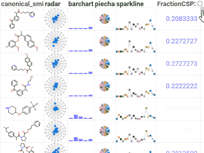 |
ScatterplotDisplays data points on the X and Y axes to show the relationship between two variables. Show up to three additional data dimensions by using marker color, shape, and size.Supports regression lines, and data annotations. | 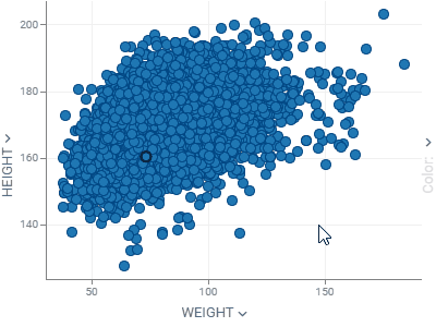 |
Pareto front viewerHighlights the set of non-dominated solutions in a multi-objective optimization problem, where improving one goal necessarily degrades at least one other. Represents the optimal trade-offs between conflicting objectives.Is a part of the EDA package. |  |
HistogramShows the distribution of numerical data. Supports multiple distributions, with a few normalization options. Use the slider below to filter the dataset. | 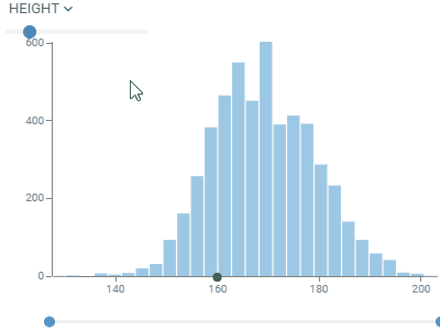 |
Line chartShows points connected by lines. Points are ordered by the X component, with multiple values for the same X aggregated.Supports multiple charts, multiple axes, different normalization and aggregation options. Chart types: lines, area, stacked bar chart, stacked area chart. | 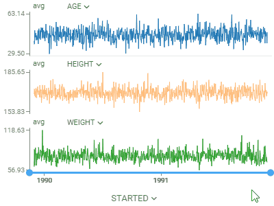 |
Bar chartShows grouped data with rectangular bars with lengths proportional to the values that they represent.Supports multiple data type-dependent aggregation functions for values. Works with dates as a category, converting them to year, Q1-Q4, or month. To create a stacked bar chart, use the Stack selector. | 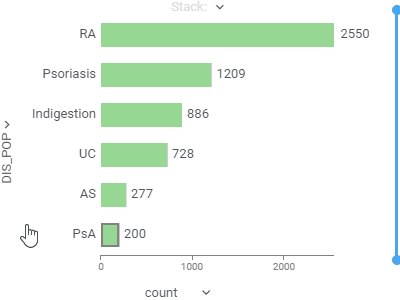 |
Box plotSummarizes distributions of values by showing minimum, first quartile, median, third quartile, and maximum.Shows each point and lets you color-code them. When comparing multiple sets, automatically tests for statistical significance and calculates p-values. | 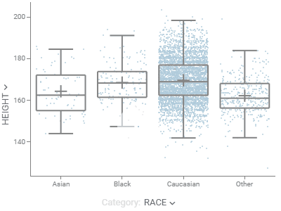 |
Pie chartShows proportions by dividing data into slices. | 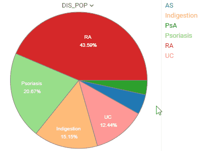 |
Trellis plotLets you analyze multiple dimensions of your data simultaneously.For categorical columns, unique values along the X and Y axes create subsets of data. Each intersecting cell visualizes rows belonging to the corresponding subset. Supports multiple columns per axis and multiple chart options. | 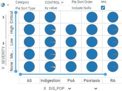 |
Parallel coordinates plotShows each row as a trajectory, where each column value gets mapped to the corresponding axis.Useful for analyzing multidimensional data. | 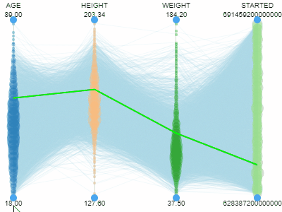 |
3D scatterplotShows the relationship between three variables in 3d space.You can color-code points, size-code points, and display labels next to markers. | 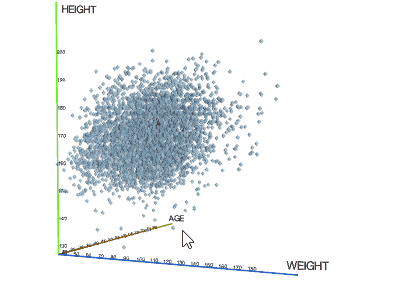 |
CalendarLets you analyze longitudinal data. Requires at least one column of type DateTime. | 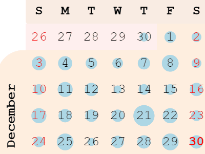 |
Tree mapDisplays hierarchical data as a set of nested rectangles. A leaf node's rectangle has an area proportional to a specified dimension of the data. | 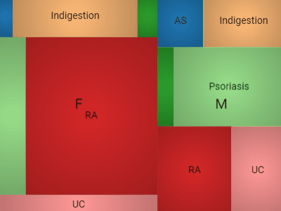 |
FormLets you customize the appearance of the row by manually positioning the fields, and adding other visual elements, such as pictures or panels.A form can be used either as a standalone viewer, or as a row template of the Tile Viewer. |  |
Tile viewerVisualizes rows as forms positioned as tiles.Useful for reviewing the contents of each row. |  |
Pivot tableDisplays grouped values with customizable aggregation functions (sum, average, count, etc.) and allows pivoting rows into columns to create cross-tabulated summaries.Supports filtering and coloring. |  |
Word cloudA visual depiction of word frequency.You can use other aggregation functions to represent the size or color of the specific word. |  |
Density plotShows density of points for the chosen X and Y columns, unlike scatter plot that shows all of them. |  |
Matrix plotShows the relationships between the selected columns using density plots and histograms. |  |
Network diagramVisualizes graphs, with values of the specified two columns as nodes, and rows as edges.To the right, you see relationships between the Game of Thrones characters. Can you guess what the two clusters are? |  |
HeatmapA condensed representation of the grid that shows the entire dataset at once with color-coded cells |  |
FiltersLet you quickly filter and select rows based on the column values.Filters automatically adjust to the data type and semantics. Built-in filters: numerical, categorical, molecular, sequences, calendar, free text, lists, etc. |  |
Statistics viewerProvides descriptive statistical measures for selected columns in your dataset: average, median, standard deviation, min/max values, and unique and missing value counts. Use it to get a quick numerical summary of your data's distribution and characteristics. |  |
Correlation plotLets you see correlations between all columns at once. Cells are color-coded by the Pearson correlation coefficient.Histograms along the diagonal show the corresponding distribution. Hover over the cell to see the corresponding scatter plot. The grid is sortable. |  |
Markup ViewerUse to host any text, arbitrary HTML content, or markdown-formatted text. In most cases, the viewer will auto-detect content type. Use the "Content Type" property to explicitly specify it. |  |
Scripting viewerCreates custom visualizations using scripts written in R, Python, Julia, or other supported languages.The viewer automatically generates UI controls for script parameters based on the script's input annotations. |  |
RadarDisplays multivariate data on axes starting from the same point, useful for plotting groups of values over several common variables.Is a part of the Charts package. |  |
SunburstShows hierarchical data as concentric rings, where each ring represents a level in the hierarchy.Is a part of the Charts package. |  |
Tree viewerShows hierarchical data as a tree structure with nodes and connections. Supports color-coding and size-coding.Is a part of the Charts package. |  |
Scaffold treeA chemical analysis tool that organizes molecules into a hierarchical tree based on their scaffolds. Supports automatic generation, manual sketching, or loading from a file. Enables color-coding of scaffolds and highlighting of matching molecules.Is a part of the Chem package. |  |
Forms viewerShows multiple rows as customizable forms positioned side-by-side. Supports color-coding and substructure highlighting.Is a part of the Power Grid package. |  |
Multi curve viewerSuperimposes multiple in-cell fitted curves onto a single chart for comparative analysis. Supports logarithmic scales and series merging. Particularly useful for dose-response analysis and as an inner viewer in trellis plot.Is a part of the Curves package. |  |
Biostructure viewerMol*-based 3D viewer for molecular visualization and docking analysis. Supports interactive exploration of macromolecules, multiple rendering modes, and opens PDB, CIF, MOL2, and XYZ formats.Is a part of the Biostructure Viewer package. |  |
NGL viewerSpecialized 3D viewer for formats not supported by Mol* (MMTF, PLY, OBJ, CCP4). Use it for these file types or when NGL’s unique rendering capabilities are required.Is a part of the Biostructure Viewer package. |  |
Web LogoVisualizes a graphical representation of multiple sequence alignment for amino acids, nucleotides, or modified residues with multi-character labels. Each logo consists of stacks of symbols, one for each position in the sequence.Is a part of the Bio package. | |
Sequence variability map viewerA matrix-style viewer that displays positions as columns and monomers as rows, operating in two distinct modes: Mutation Cliffs and Invariant Map. It is used in the Peptides SAR analysis.Is a part of the Peptides package. |  |