Supported viewers
This is a list of all available viewers. Check this document to learn how to work with them, such as creating, docking, interacting, working with properties, selecting and filtering rows, using tooltips, reusing layouts, and a lot more!
GridA high-performance, customizable spreadsheet optimized for interactive exploration of data.Provides color-coding, filtering, sorting, custom cell types, and hundreds of other features. | 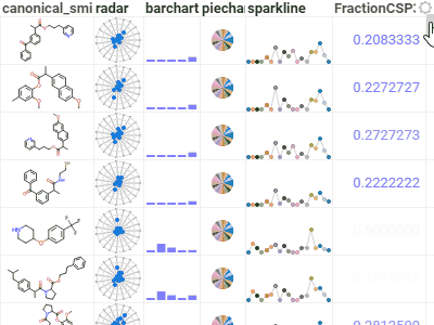 |
ScatterplotDisplays data points on the X and Y axes to show the relationship between two variables. Show up to three additional data dimensions by using marker color, shape, and size.Supports regression lines, and data annotations. | 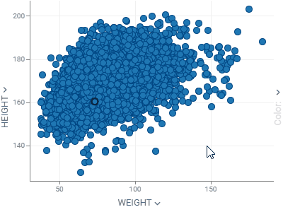 |
HistogramShows the distribution of the numerical data. Supports multiple distribution, with a few normalization options. Use the slider below to filter the dataset. | 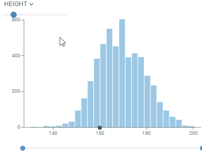 |
Line chartShows points connected by lines. Points are ordered by the X component, with multiple values for the same X aggregated.Supports multiple charts, multiple axes, different normalization and aggregation options. Chart types: lines, area, stacked bar chart, stacked area chart. | 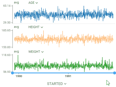 |
Bar chartShows grouped data with rectangular bars with lengths proportional to the values that they represent.Supports multiple data type-dependent aggregation functions for values. Works with dates as a category, converting them to year, Q1-Q4, or month. To create a stacked bar chart, use the Stack selector. | 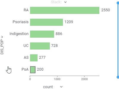 |
Box plotSummarizes distributions of values by showing minimum, first quartile, median, third quartile, and maximum.Shows each point and lets you color-code them. When comparing multiple sets, automatically tests for statistical significance and calculates p-values. | 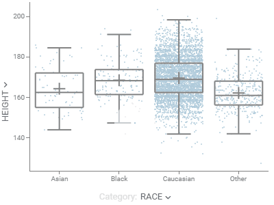 |
Pie chartShows proportions by dividing data into slices. | 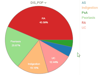 |
Parallel coordinates plotShows each row as a trajectory, where each column value gets mapped to the correponding axis.Useful for analyzing multidimensional data. | 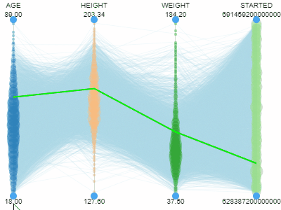 |
3D scatterplotShows the relationship between three variables in 3d space.You can color-code points, size-code points, and display labels next to markers. | 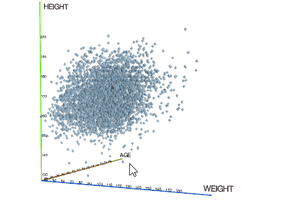 |
CalendarLets you analyze longitudinal data. Requires at least one column of type DateTime. | 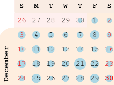 |
Trellis plotLets you analyze multiple dimensions of your data simultaneously.For categorical columns, unique values along the X and Y axes create subsets of data. Each intersecting cell visualizes rows belonging to the corresponding subset. Supports multiple columns per axis and multiple chart options. | 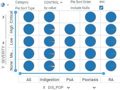 |
Tree mapDisplays hierarchical data as a set of nested rectangles. A leaf node's rectangle has an area proportional to a specified dimension of the data. | 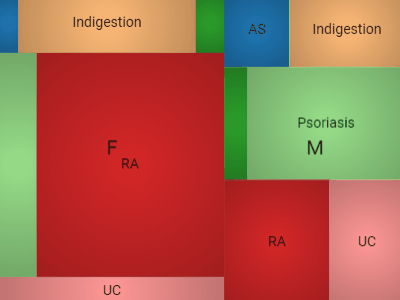 |
FormLets you customize the appearance of the row by manually positioning the fields, and adding other visual elements, such as pictures or panels.A form can be used either as a standalone viewer, or as a row template of the Tile Viewer. | 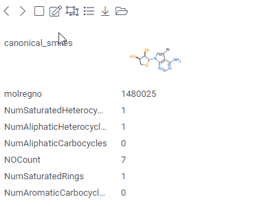 |
Tile viewerVisualizes rows as forms positioned as tiles.Useful for reviewing the contents of each row. | 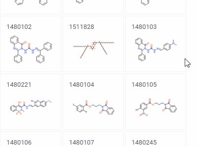 |
Word cloudA visual depiction of word frequency.You can use other aggregation functions to represent the size or color of the specific word. |  |
Density plotShows density of points for the chosen X and Y columns, unlike scatter plot that shows all of them. | 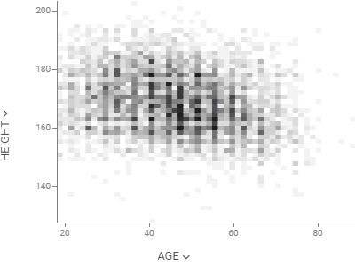 |
Matrix plotShows the relationships between the selected columns using density plots and histograms. | 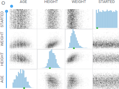 |
Network diagramVisualizes graphs, with values of the specified two columns as nodes, and rows as edges.To the right, you see relationships between the Game of Thrones characters. Can you guess what the two clusters are? | 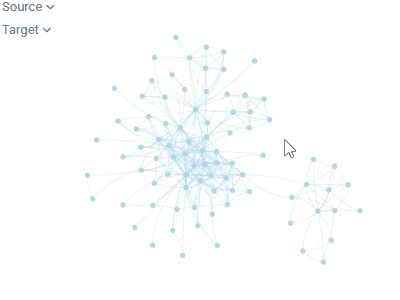 |
HeatmapA condensed representation of the grid, where it shows all dataset at once with the color-coded cells | 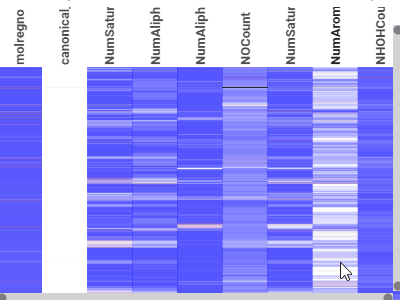 |
FiltersLet you quickly filter and select rows based on the column values.Filters automatically adjust to the data type and semantics. Built-in filters: numerical, categorical, molecular, sequences, calendar, free text, lists, etc. | 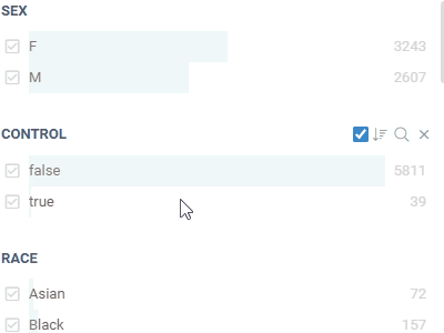 |
Correlation plotLets you see correlations between all columns at once. Cells are color-coded by the Pearsson correlation coefficient.Histograms along the diagonal show the corresponding distribution. Hover over the cell to see the corresponding scatter plot. The grid is sortable. | 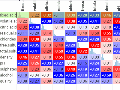 |
Markup ViewerUse to host any text, arbitrary HTML content, or markdown-formatted text. In most cases, the viewer will auto-detect content type. Use the "Content Type" property to explicitly specify it. |  |