Heatmap
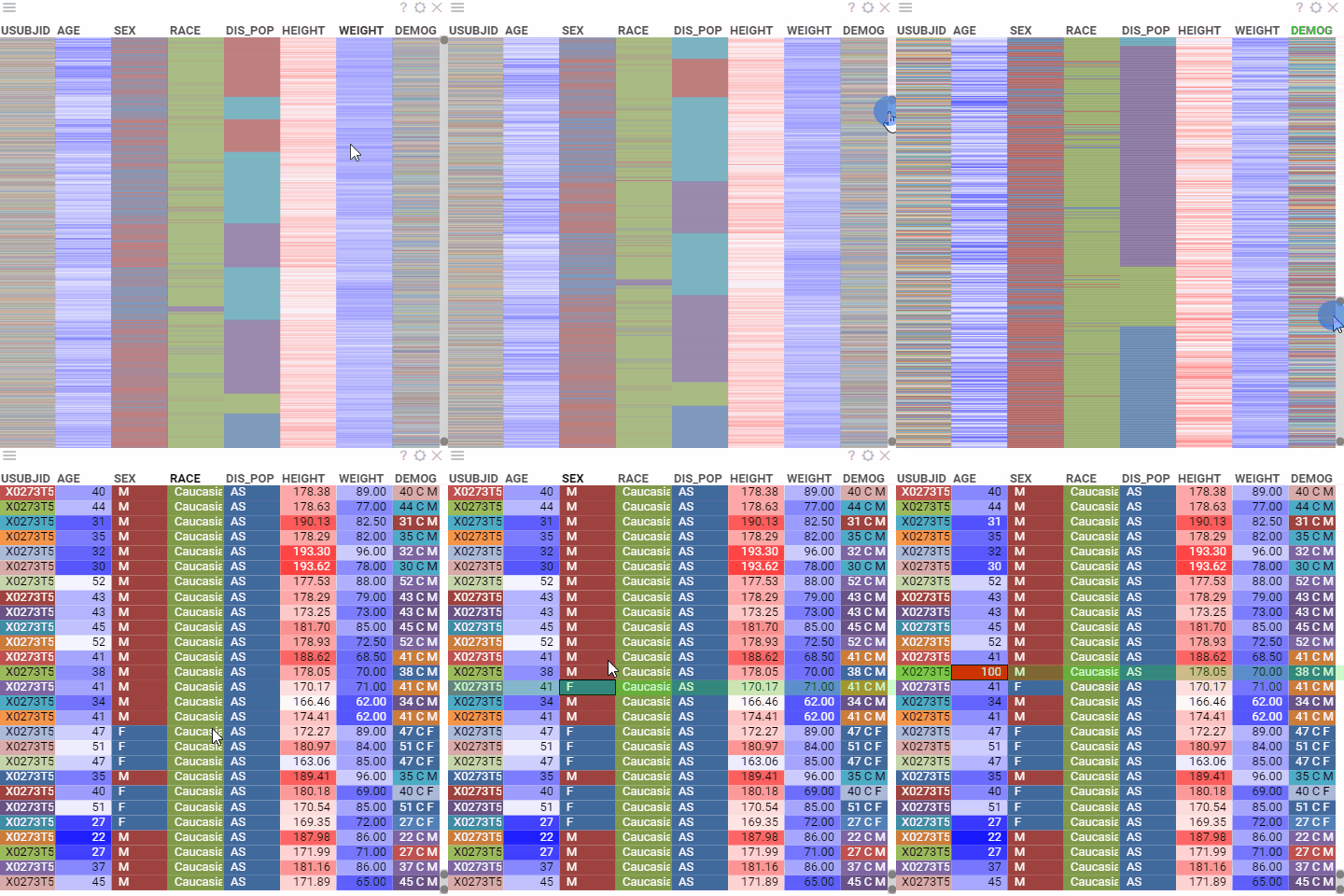
A heatmap is a spreadsheet (grid) that displays colors instead of numbers and strings. For numerical data, the higher values are colored red, and the lower ones appear blue. The central value is assigned a light color so that darker colors indicate a larger distance from the center. For categorical data, each possible value is set to one color from a qualitative palette.
Heatmap displays more data in a smaller area. Use it to cross-examine multivariate data and show the intensity and difference between variables.
Note: Heatmap is based on grid, so you can apply all of the grid's features to it as well.
Adding
- Go to Tables and expand the Viewers panel.
- Locate the Heatmap icon and click it.
Developers: To add the viewer from the console, use:
grok.shell.tv.addViewer('Heatmap');
Initially, the viewer displays a heatmap of the entire dataset on a screen. Pan or resize the range slider on the right to control how many rows are shown.
Settings
To configure a heatmap, click the Gear icon on top of the viewer and use the info panels on the Context Pane. For example, you can:
- Configure the data display detailing using one of the following methods:
- Set the desired row height under the Row Height setting.
- On the viewer, configure vertical and horizontal range sliders.
- Choose which rows to show using the
Show Filtered Rows Onlyproperty. - Configure any other option as you would for a grid.
Interactivity
Heatmap responds to the row selection and data filtering.

