Box plot
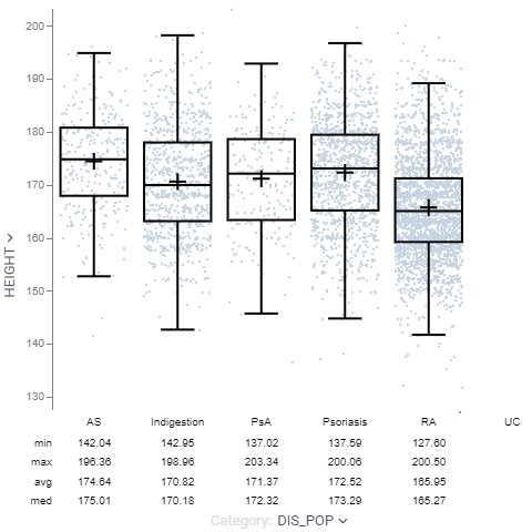
The box plot (a.k.a. box and whisker diagram) is a standardized way of displaying the distribution of data based on the five number summary: minimum, first quartile, median, third quartile, and maximum.
Developers: To add the viewer from the console, use:
grok.shell.tv.addViewer('Box plot');
General:
| Right click | Context menu |
| Alt+F | Show in full screen |

T-test
When the "category" column contains exactly two categories, press "T" to perform Welch's t-test. The resulting p-value will then be shown on top of the box plot.
Inverted whiskers
On certain datasets, you may see whiskers extending inside the box plot. This is not a rendering bug. The bottom of the box is at the 1st quartile (Q1), and the top is at the 3rd quartile (Q3) value. The whiskers are the lines that extend from the top and bottom of the box to the adjacent values. The adjacent values are the lowest and highest observations that are still inside the region defined by the following limits:
Lower Limit: Q1 - 1.5 (Q3 - Q1) Upper Limit: Q3 + 1.5 (Q3 - Q1)
However, the upper adjacent value can be less than Q3, which forces the whisker to be drawn from Q3 into the box. The lower adjacent value can also be greater than Q1, which forces the whisker to be drawn from Q1 into the box.
For instance, you would get the upper whisker inverted on the following data: [0, 41, 42, 70]
Videos
Properties
| Property | Type | Description |
|---|---|---|
| Data | ||
| Category1 Column Name | string | If Category 2 is not defined, sets Markers Color the same as the currently selected column. |
| Category1 Map | string | Time unit map function for Category 1 Column Names (applicable to dates only). |
| Category2 Column Name | string | If defined, sets Markers Color the same as the currently selected column. |
| Category2 Map | string | Time unit map function for Category 2 Column Names (applicable to dates only). |
| Filter | string | Formula that filters out rows to show. Examples: ${AGE} > 20 or ${WEIGHT / 2)} > 100, ${SEVERITY} == ''Medium'', ${RACE}.endsWith(''sian'') |
| Table | string | |
| Statistics | ||
| Show Statistics | boolean | |
| Statistics Format | string | Format for statistics and p-value values. |
| Show Total Count | boolean | |
| Show Inliers Count | boolean | Shown values count inside lower and upper bounds, where: IQR = Q3 - Q1. Lower Bound = Q1 - (1.5 * IQR). Upper Bound = Q3 + (1.5 * IQR). |
| Show Outliers Count | boolean | Shown values count outside lower and upper bounds, where: IQR = Q3 - Q1. Lower Bound = Q1 - (1.5 * IQR). Upper Bound = Q3 + (1.5 * IQR). |
| Show Min | boolean | |
| Show Max | boolean | |
| Show Avg | boolean | |
| Show Med | boolean | |
| Show Stdev | boolean | |
| Show Q1 | boolean | |
| Show Q3 | boolean | |
| Category | ||
| Show Category Axis | boolean | |
| Show Category Selector | boolean | |
| Label Orientation | textorientation | |
| Show Minor Categories | boolean | Display subcategories - category combinations in the x axis table. |
| Value | ||
| Value Column Name | string | |
| Axis Type | string | |
| Value Min | number | |
| Value Max | number | |
| Invert Y Axis | boolean | |
| Show Value Axis | boolean | |
| Show Value Selector | boolean | |
| Zoom Values By Filter | boolean | If checked, focuses on filtered points (on value axis) as the filter changes. If current value column is filtered, zoom is not applied. |
| Show Empty Categories | boolean | Include plots, which are empty or have null values. |
| Color | ||
| Bin Color Column Name | string | Column to color-code boxes (Q2-Q3 region) or inner violin shapes. See also Bin Color Aggr Type. |
| Bin Color Aggr Type | string | Aggregation function for color-coding. See also Bin Color. |
| Show Color Selector | boolean | |
| Marker Color Column Name | string | Column to color-code markers. Changing Category 1 or Category 2 sets the color scheme to categorical (same as selected category column). |
| Marker Color Map | string | Categorical coloring time unit map function (applicable to dates only). |
| Color Axis Type | string | |
| Invert Color Scheme | boolean | |
| Color Min | number | |
| Color Max | number | |
| Marker | ||
| Markers Column Name | string | |
| Markers Map | string | Marker category time unit map function (applicable to dates only). |
| Marker Min Size | number | |
| Marker Max Size | number | |
| Marker Type | string | |
| Marker Size | number | |
| Marker Opacity | number | |
| Size | ||
| Show Size Selector | boolean | |
| Marker Size Column Name | string | |
| General | ||
| Show Mean Cross | boolean | |
| Show Lower Dash | boolean | |
| Show Upper Dash | boolean | |
| Show Median Dash | boolean | |
| Show Values Limit | number | Points are not shown if the number of rows is greater than Show Values Limit. |
| Show Inside Values | boolean | Show points inside the interquartile range (Q3 - Q1). |
| Show Outside Values | boolean | Show points outside the interquartile range (Q3 - Q1). |
| Show P Value | boolean | Show p-value. Press T to toggle. Currently works only when there are two categories. Welch''s t-test is used for calculating the p-value. |
| Show Mouse Over Point | boolean | |
| Show Mouse Over Row Group | boolean | |
| Statistics | list | |
| Whisker Color | number | |
| Violin Whisker Color | number | |
| Back Color | number | |
| Filtered Rows Color | number | |
| Filtered Out Rows Color | number | |
| Selected Rows Color | number | |
| Missing Value Color | number | |
| Default Box Color | number | |
| Legend Visibility | visibilitymode | |
| Legend Position | flexautoposition | |
| Row Source | string | Determines the rows shown on the plot. |
| Allow Dynamic Menus | boolean | |
| Show Context Menu | boolean | Properties common for all viewers todo: use code generation |
| Title | string | |
| Description | string | Viewer description that gets shown at the Descriptor Position. Markup is supported. |
| Help | string | Help to be shown when user clicks on the ''?'' icon on top. Could either be in markdown, or a URL (starting with ''/'' or ''http''). |
| Description Position | flexposition | |
| Description Visibility Mode | visibilitymode | |
| Style | ||
| Auto Layout | boolean | |
| Show All Categories | boolean | When checked, both categories from Category 1 and Category 2 columns are shown ignoring axis size adjustments. |
| Plot Style | string | |
| Axis Font | string | |
| Category Font | string | |
| Statistics Font | string | |
| Formula Font | string | |
| Annotation Font | string | |
| Whisker Line Width | number | |
| Interquartile Line Width | number | Width of interquartile line, if Auto Layout is enabled, it will be scaled when violins are too narrow. |
| Whisker Width Ratio | number | |
| Axis Use Column Format | boolean | |
| Bins | number | Number of KDE bins to display a violin plot. |
| Linear Color Scheme | list | |
| Categorical Color Scheme | list | |
| Controls Font | string | Viewer controls elements font. |
| Lines | ||
| Show Dataframe Formula Lines | boolean | Control the visibility of dataframe-originated formula lines. Edit formula lines by right-clicking and selecting Tools | Formula Lines from the popup menu. Requires the PowerPack plugin. |
| Show Viewer Formula Lines | boolean | Control the visibility of viewer-originated formula lines. Edit formula lines by right-clicking and selecting Tools | Formula Lines from the popup menu. Requires the PowerPack plugin. |
| Annotation regions | ||
| Show Viewer Annotation Regions | boolean | |
| Show Dataframe Annotation Regions | boolean | |
| Tooltip | ||
| Show Tooltip | string | Controls box plot tooltip visibility |
| Show Labels | visibilitymode | |
| Row Tooltip | string | Newline-separated list of column names to be used in a tooltip. Requires showTooltip to be enabled. |
| Description | ||
| Show Title | boolean |
See also:
