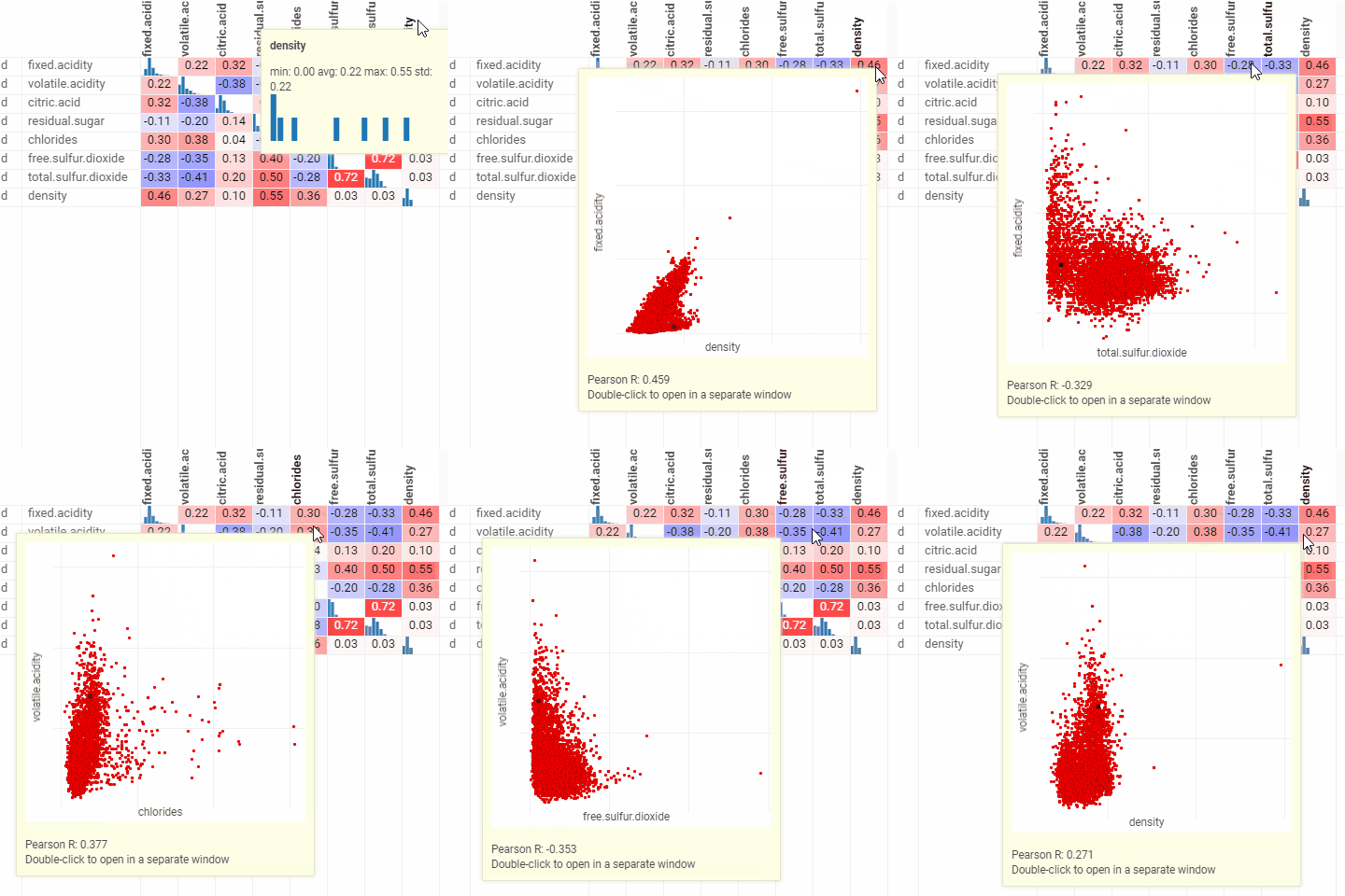
Correlation plot
A quick way to assess correlations between all columns at once. Cells are color-coded by the Pearson correlation coefficient or Spearman's rank correlation coefficient . Histograms along the diagonal show the corresponding distribution. Hover over the cell to see the corresponding scatter plot. The grid is sortable. Select columns in the view by selecting corresponding rows.
Developers: To add the viewer from the console, use:
grok.shell.tv.addViewer('Correlation plot');
General:
| Right click | Context menu |
| Header double-click | Sort column |

Properties
| Property | Type | Description |
|---|---|---|
| General | ||
| X Column Names | list | Columns to be put on the X axis |
| Y Column Names | list | Columns to be put on the Y axis |
| Correlation Type | correlationtype | |
| Show Pearson R | boolean | Shows the Pearson correlation coefficient inside the corresponding cell. |
| Show Tooltip | boolean | Shows the tooltip with the corresponding scatter plot inside. |
| Ignore Double Click | boolean | Ignores double click behavior on the grid cells. |
| Back Color | number | |
| Row Source | string | Determines the rows shown on the plot. |
| Allow Dynamic Menus | boolean | |
| Show Context Menu | boolean | Properties common for all viewers todo: use code generation |
| Title | string | |
| Description | string | Viewer description that gets shown at the Descriptor Position. Markup is supported. |
| Help | string | Help to be shown when user clicks on the ''?'' icon on top. Could either be in markdown, or a URL (starting with ''/'' or ''http''). |
| Description Position | flexposition | |
| Description Visibility Mode | visibilitymode | |
| Style | ||
| Default Cell Font | string | |
| Col Header Font | string | |
| Data | ||
| Filter | string | Formula that filters out rows to show. Examples: ${AGE} > 20 or ${WEIGHT / 2)} > 100, ${SEVERITY} == ''Medium'', ${RACE}.endsWith(''sian'') |
| Table | string | |
| Description | ||
| Show Title | boolean |
See also: